Colours may appear different on your screen. Please check your colour on the Sigma colour-chart instore, or try a sample before purchasing.
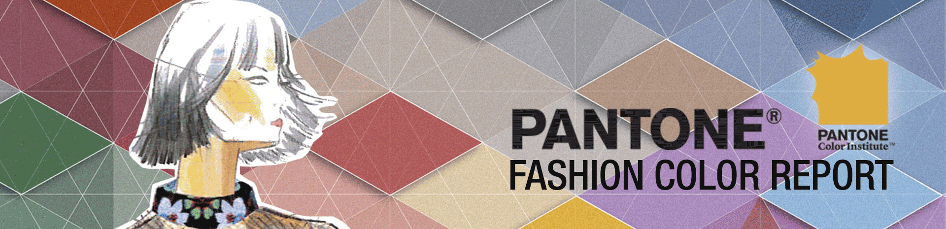
Pantone, once again, has made a fashionable entrance with its new selection of fall colours. If you’re a fashion crazed teen seeking to stay on track with the trend or if you’re an adult looking to infuse your walls with a fashionista’s sense of style, keep reading to find out the 10 colours you need to be applying this fall!
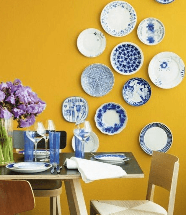
Leading the pack this season is Riverside. This gorgeous blue hue is guaranteed to remind you of a Juicy Couture velour tracksuit, that iconic 90s staple guilty pleasure we all had at one point or another. Apart from adding a level of sophistication to your rooms, this hue is bound to deliver the calm you’ve been lacking in your life. It’s ideal for your bedroom and living room, the places you seek for relaxation the most. Make sure to contrast the tranquility this colour offers with a fierce gold to better unleash its effect.
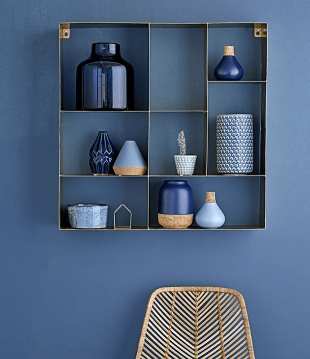
Colour code: S 2060-R80B Image Source
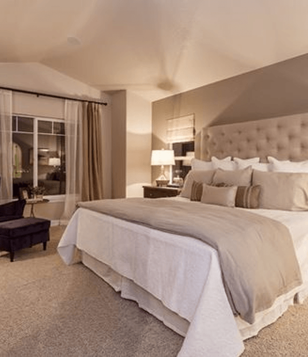
Next up, Airy Blue mildly resembles Pantone’s colour of the year; Serenity. This light shade of blue evokes a feeling of weightlessness and peace. Its resemblance to the sky manages to infuse your walls with an illusion of infinity. If you’re looking to either add length to your rooms or if you’re seeking to give your rooms a comforting feeling, this is the one to go for.
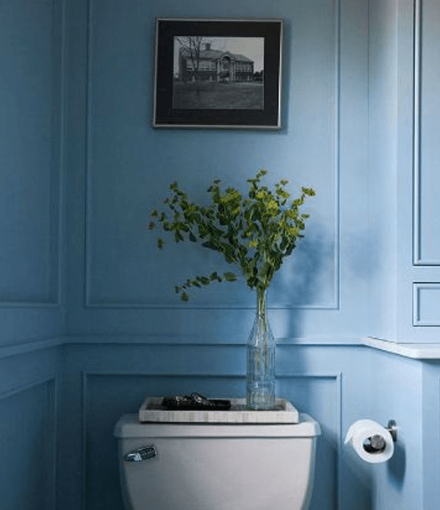
Colour Code: S 1550-R80B Image Source
Fear not, don’t let this colour’s name turn you off from giving it a shot! Sharkskin is far from being dull or boring, in fact its name is a clear indicator of its fierce nature. Regardless of its untameable spirit, this colour, like any other neutral hue, is adaptable to any situation and decor you choose to pair with it. It’s timeless and sophisticated nature is bound to guarantee the balance and neutrality a person should never do without.
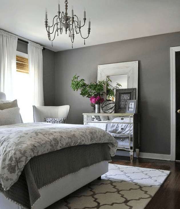
Colour Code: S 2002-B, S 5502-B Image Source
The next colour on the list is a passionate one – meet the beautiful Aurora Red. The warm, sensual aura this colour releases inevitably brings your walls to life. Do not mistake this colour for simply a romantic one, though. Aurora red is strong, fierce and intense – convey your desired meaning by pairing up the decor accordingly. In the picture below, Picsdecor infused its room with a bohemian style to provide a fierce, passionate look.
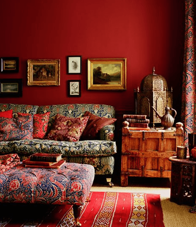
Colour Code: S 3560-Y90R Image Source
The neutrality Warm Taupe offers is ideal for colour blocking. This grounded colour pairs well with any shade, decor or lighting you might throw at it. Make sure to check out our blog post on neutral paints – Finding Beauty in Neutral Colours – in order to find ou2t how to best put Warm Taupe to play!
Colour Code: S 2020-Y90R, S 7010-Y50R Image Source
Airy Blue is to Serenity what Dusty Cedar is to Rose Quartz. That’s right, this shade is a toned up version of a colour you may be now familiar with thanks to one of our most recent blog posts – Rose Quartz for 2016 -. Rose Quartz, Pantone’s second colour of the year. This dusty rose hue and the sophistication it embodies is gorgeous. Although light tones aren’t for everyone, they’re known to provide an element of spaciousness and light for your rooms! If you’re looking to break out of your comfort zone, make sure to take on Dusty Cedar – the end result will pay off.
Colour Code: S 2040-R10B Image Source
Here’s a colour for the more adventurous ones: Lush Meadow! Even its name brings an image of fauna and flora to mind. The rich colour is assured to fill your rooms with vibrancy and energy. While it may prove to be challenging to match with decor due to its exclusivity, this elegant colour is sure to provide you with the uniqueness and eccentricity you may be on the lookout for.
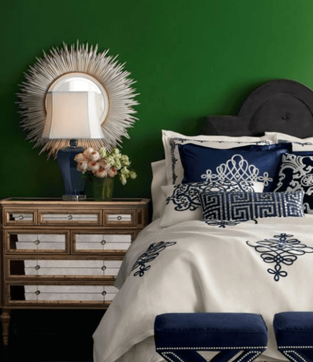
Colour Code: RAL 6001 Image Source
Hmm, we love our mustard here at Sigma. There isn’t a mustard wall we haven’t stopped to photograph, so this Fall’s Spicy Mustard is the best next thing! Its exotic look goes perfectly with our little Mediterranean island. We found that Apartment Therapy’s use of geometric shapes in contrast with this colour proved to be an exceptional addition to these walls.
Colour Code: RAL 1032 Image Source
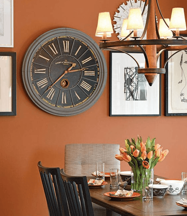
You have to agree with us on this one, this warm orange Potter’s Clay brings pumpkins and autumn leaves to mind, a perfect backdrop for the fall. Although this colour is not magical in itself, it’s guaranteed to bring out a fantastical element with its impressive adaptability. This wholesome colour is set to accompany whichever decor you choose to pair with it beautifully.
Colour Code: S 4050-Y80R Image Source
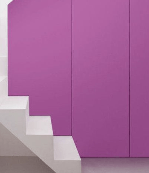
The last colour on the list is the most radiant and adventurous of all and brings out the more feminine side of us, by far. Meet Bodacious, the colour which will get your friends envying your interior design skills. This versatile, fierce colour is guaranteed to add a pop of colour to your room and bring your house to life, be it on its own or accompanied by a neutral tone. Isn’t it just stunning?
Colour Code: S 4050-R40B Image Source
What do you think of Pantone’s newest selection? Will you adopt any of these beauties to your walls? Let us know about your masterpieces in the comment section below!
S 4050-Y80R
RAL 1032
RAL 6001
S 2040-R10B
Comment:
Talk about it!