Colours may appear different on your screen. Please check your colour on the Sigma colour-chart instore, or try a sample before purchasing.
The hype about monochromes has only increased in the past years. Contrary to what most believe, a monochrome palette needn’t be simply black and white – but simply values of one singular color.
Going for monochromes is a brave, risque choice, but if you go about it the right way, we’re sure you’ll achieve stunning results. That’s exactly why we’re here – to assure your success. So check out the pros we’ve outlined about adopting a monochromatic palette and brace yourselves for the beauty that will follow.
Being bold with your decor isn’t a must. Sometimes, you can simply opt for a soothing, relaxing aura. Monochromatic rooms have been proven to please your cognition due to the calm scene they portray. Check out this living room for example, isn’t it simply the epitome of a safe haven?
Colour Code: RAL 3016
Isn’t harmony and balance everything we seek in life? Blue is the perfect embodiment of this euphoric feeling, so what better than adopting a blue palette in order to bring in an element of harmony in your space? Sometimes, simply choosing linen of the same colour as your walls can create the harmony you’re after.
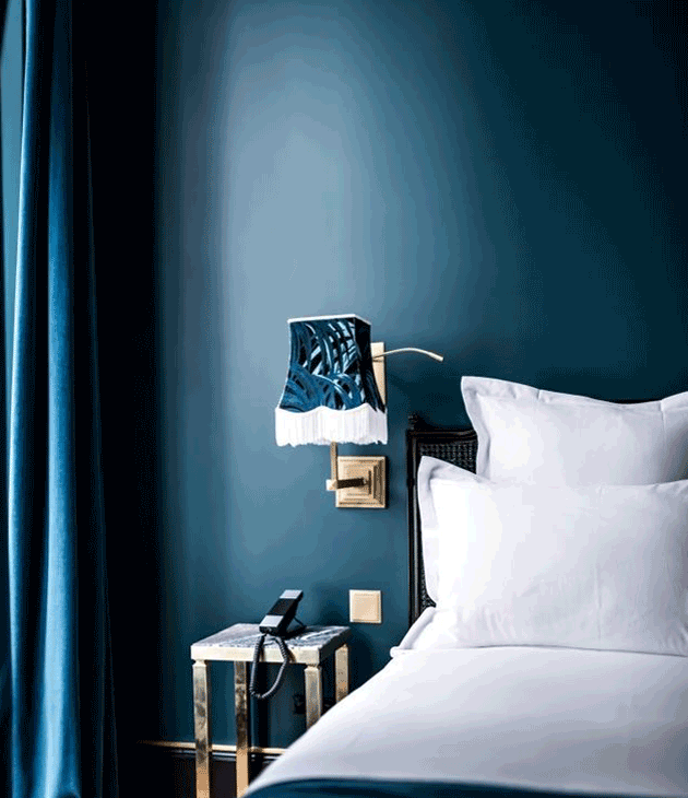
Colour Code: S 3050-R90B
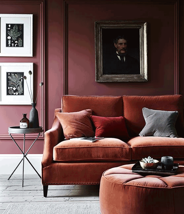
If you’ve purchased bright decor and want to bring out its majesty, going for a monochromatic palette may be the right choice! Thanks to the subtlety created by monochromes, you can bring out your decor’s best features without overdoing it. This living room, is a perfect example of this. The gold accents shine!
Colour Code: S 4020-R90B
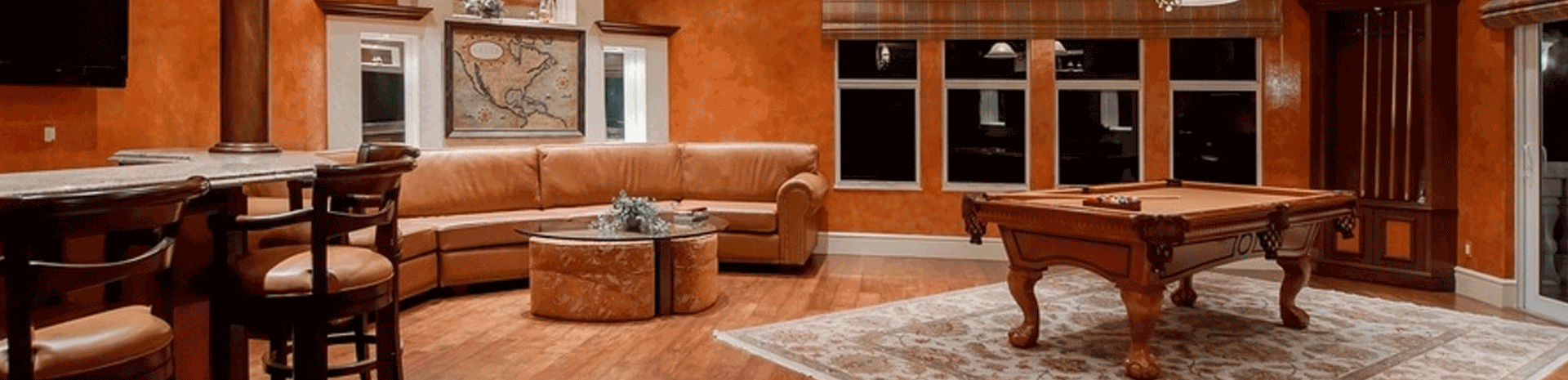
What’s the number one problem teenagers face when they move into dorm rooms, or that young couples constantly deal with in their first home? Space. While monochromes can’t knock down walls for you or buy you extra inches, they can create an illusion of space. Objects such as instruments, shelves etc. can be made to look flat when using monochromes which therefore creates ‘bigger’ rooms.
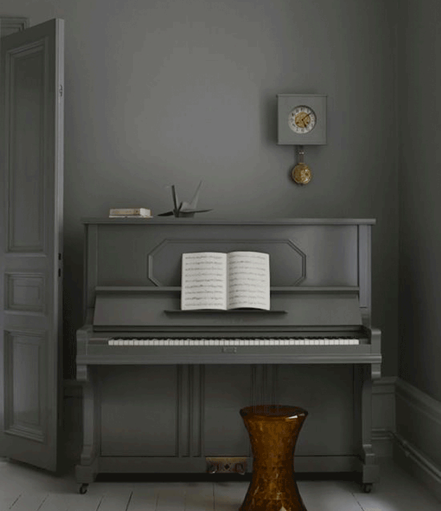
Colour Code: RAL 7037
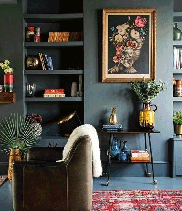
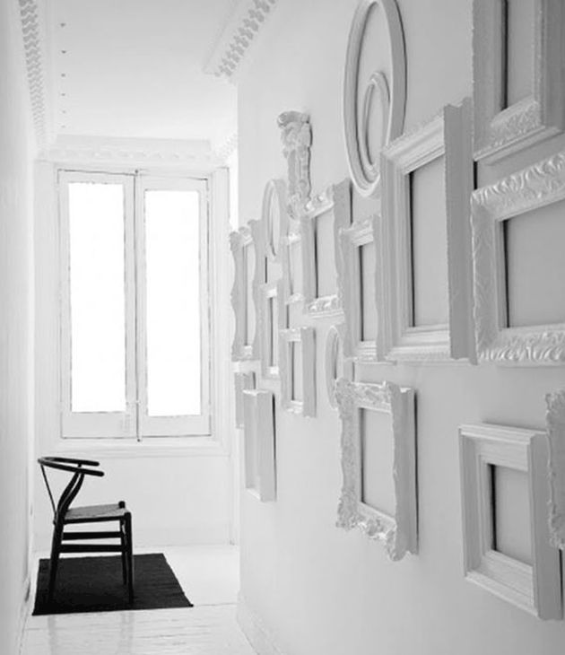
Monochromes are perfect when dealing with patterns or texture because they emphasise them further. Recording moments and sharing them proudly is big at the moment, which is why gallery walls are something most of us go for. These textured frames are displayed in all their beauty when put against walls of the same shade. Your family portraits are guaranteed to stand out.
We bet these beautiful examples of monochromatic palettes have tickled your fancy and got you visiting some Pinterest boards. Let us know about your thoughts when it comes to monochromes in the comment section below!
Colour Code:RAL 9016
S 3050-R90B
S 4020-R90B
RAL 7037
RAL 9016
Comment:
Talk about it!