Colours may appear different on your screen. Please check your colour on the Sigma colour-chart instore, or try a sample before purchasing.
This month’s contribution to the Masterpiece designer blogs comes to us from the brains behind Archi+ Architects’ Studio. They told us all about their stylish yet traditional concept behind their Maltese Themed Rental Apartments project, and we love the bold accent walls which were used to bring out the Maltese imagery and illustrations. But that’s quite enough from us, over to them:
Archi+ was commissioned by Essentially Rentals to develop a concept for the renovation of a three-bedroom apartment into two individual units to be used for short lets. The apartment is located in an area that’s packed with tourists in the summer months, so the project made perfect sense for use as a rental investment.
Both individual units feature two bedrooms, one bathroom and a living area with an integrated kitchen. The spaces reflect the needs of today’s tourist, with the areas being compact yet comfortable and with all the necessary amenities incorporated within each apartment.
We followed the brief and kicked off the project, starting with the creation of an identity for the project – a set look and feel for the apartments which can be incorporated within other properties, should the client decide to expand the operation. The general idea behind the identity is that both units would be functional and adaptable to today’s market, yet punctuated with various design elements, which are consistent throughout the different properties.
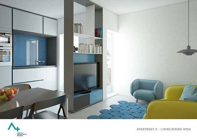
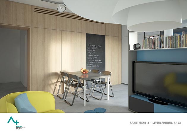
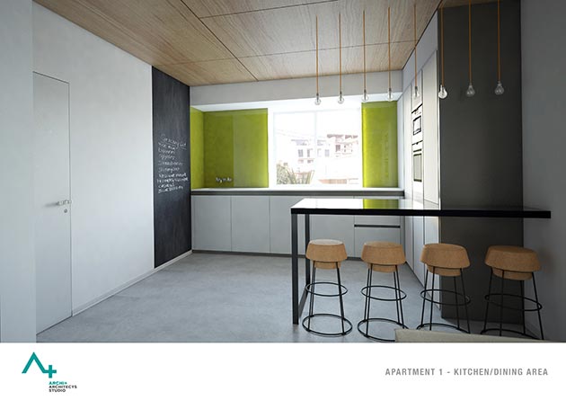
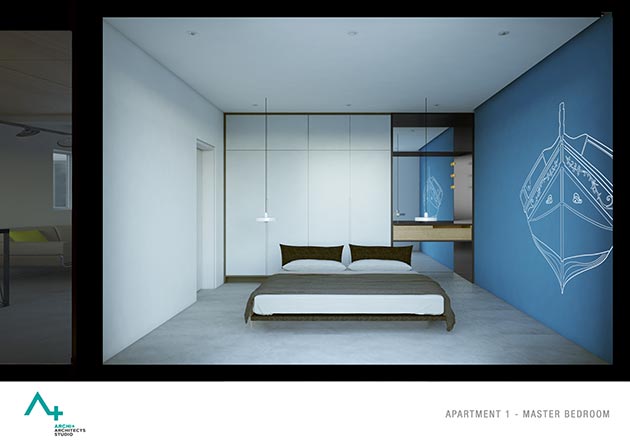
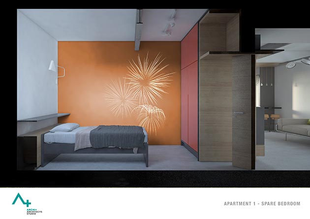
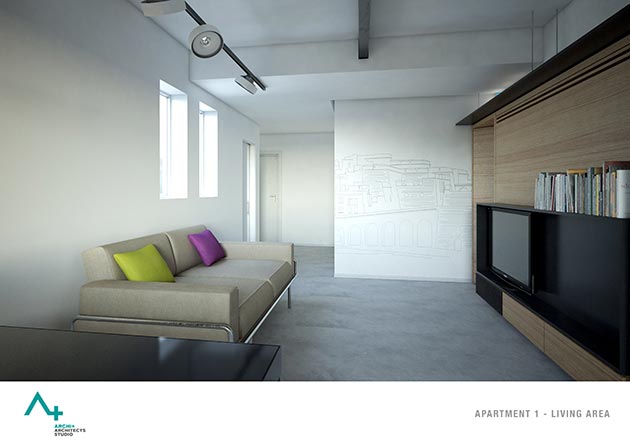
We went for a monolithic finish for the flooring and other details, such as various lighting fixtures and exposed steel beams that give an industrial feel to the space. This is subdued with the use of warm, exciting colour schemes and also assorted loose soft furniture.
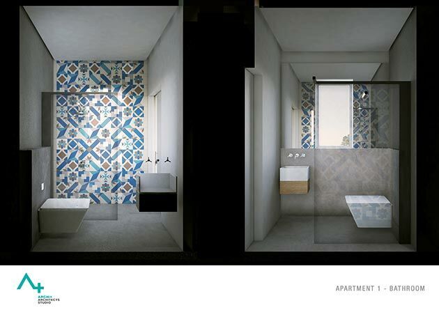
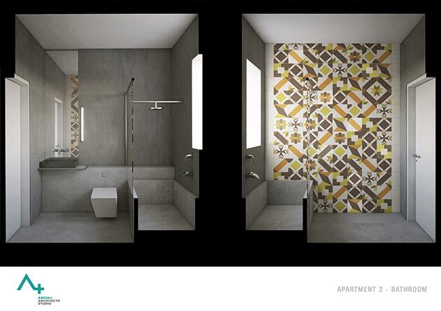
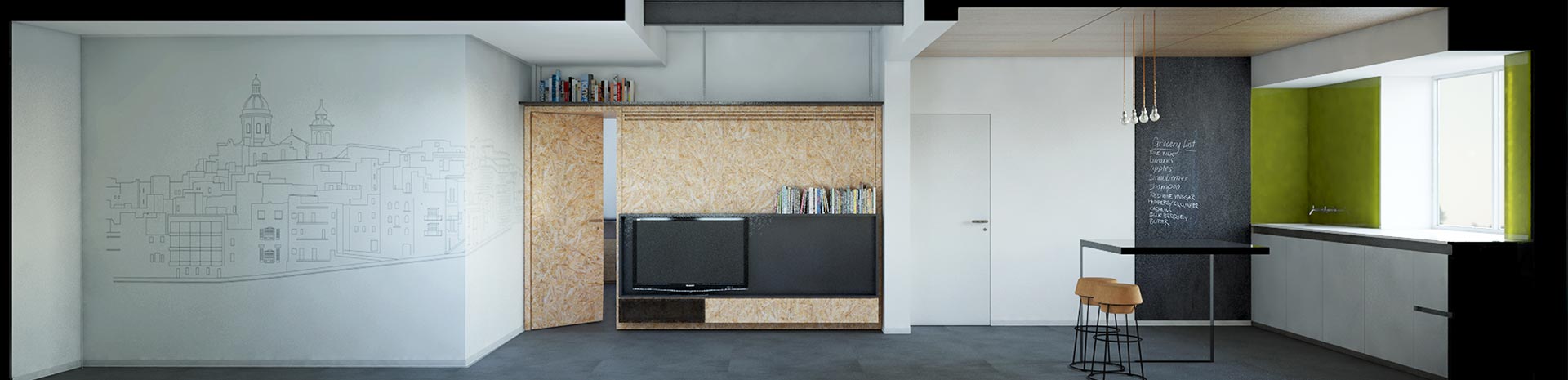
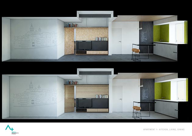
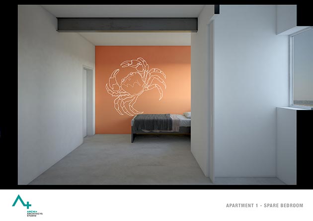
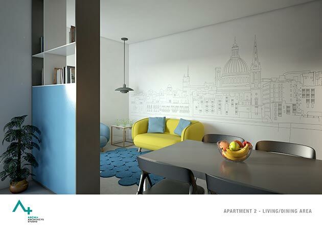
Besides using specific colour schemes, we also decided to include a number of images and prints which would be used to accentuate certain walls. The imagery we chose is synonymous with the Maltese landscape and traditions. For example, the traditional Maltese ‘dgħajsa’, the crab that featured on our old currency, the Maltese Balcony and even an image of exploding fireworks, which are a staple for every Maltese summer.
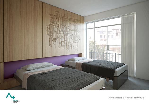
 Along with these, we went for certain well-known and easily identifiable landscapes such as the Valletta and Birgu landscape, and these also contribute to the language of the overall apartment design. These elements will be transferred onto the wall in various ways, such as etching on wood and the use of wallpaper.
All in all, the concept intends to make the best use of the available space while incorporating a visually appealing design, which provides for a functional yet aesthetically pleasing proposal.
Brilliant stuff. Our favourite has to be the balconies etched in wood in one of the bedrooms – we love the way the wood contrasts with the purple accent wall.
There’s more where that came from, of course. If you’d like to find out more about Archi+’s work and projects, check out their website or find them on Facebook.
What do you think of the project? Let us know in the comments below!
Comment:
Talk about it!